The Redesign
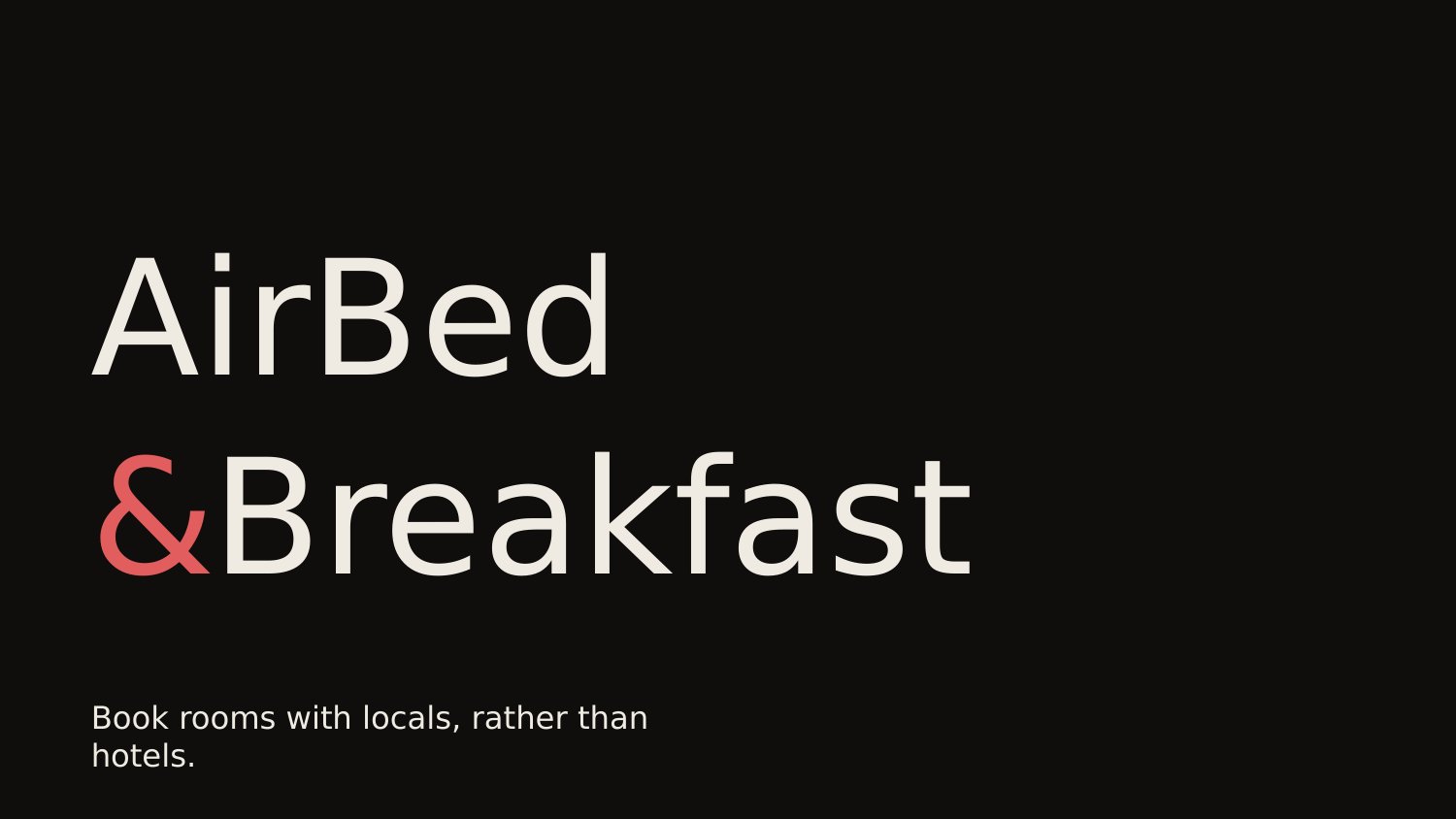
The wordmark broken across two lines, ampersand in coral, three-quarters of the canvas left empty. The cover claims its real estate by refusing to fill it.
Same argument as 2008, set as a magazine: no photos, no screenshots, one accent color carrying the weight the original gave to four.
AirBed & Breakfast was a fourteen-slide pitch for a website that let strangers rent each other's couches. It raised six hundred thousand dollars and became Airbnb. It also became the most circulated seed deck on the internet — required reading for first-time founders, dissected on Substack, frame-by-framed on Twitter. The argument inside it is sound enough that almost nobody talks about how the deck looked.
It looked like 2008. Chunky cyan-and-magenta logotype, baby-blue page, three product screenshots fanned at angles, big orange circles standing in for the market-size chart. The contemporary verdict is that this didn't matter — that narrative beat polish, that the deck closed the round despite its design. The verdict is half a compliment. The other half is: a serious argument deserves serious staging.
This redesign is the staging exercise. Same fourteen slides, same words, same business — re-set in the design language of a current marketplace pitch. Not slicker. Not more corporate. Quieter. The bet is that an argument this clean reads even better when nothing else is shouting over it.
The wordmark broken across two lines, ampersand in coral, three-quarters of the canvas left empty. The cover claims its real estate by refusing to fill it.
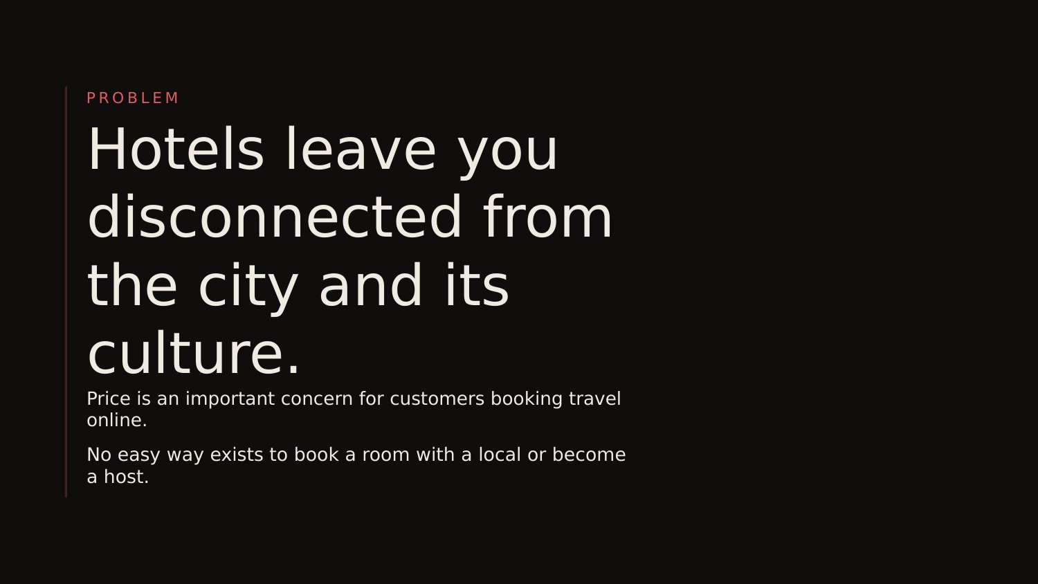
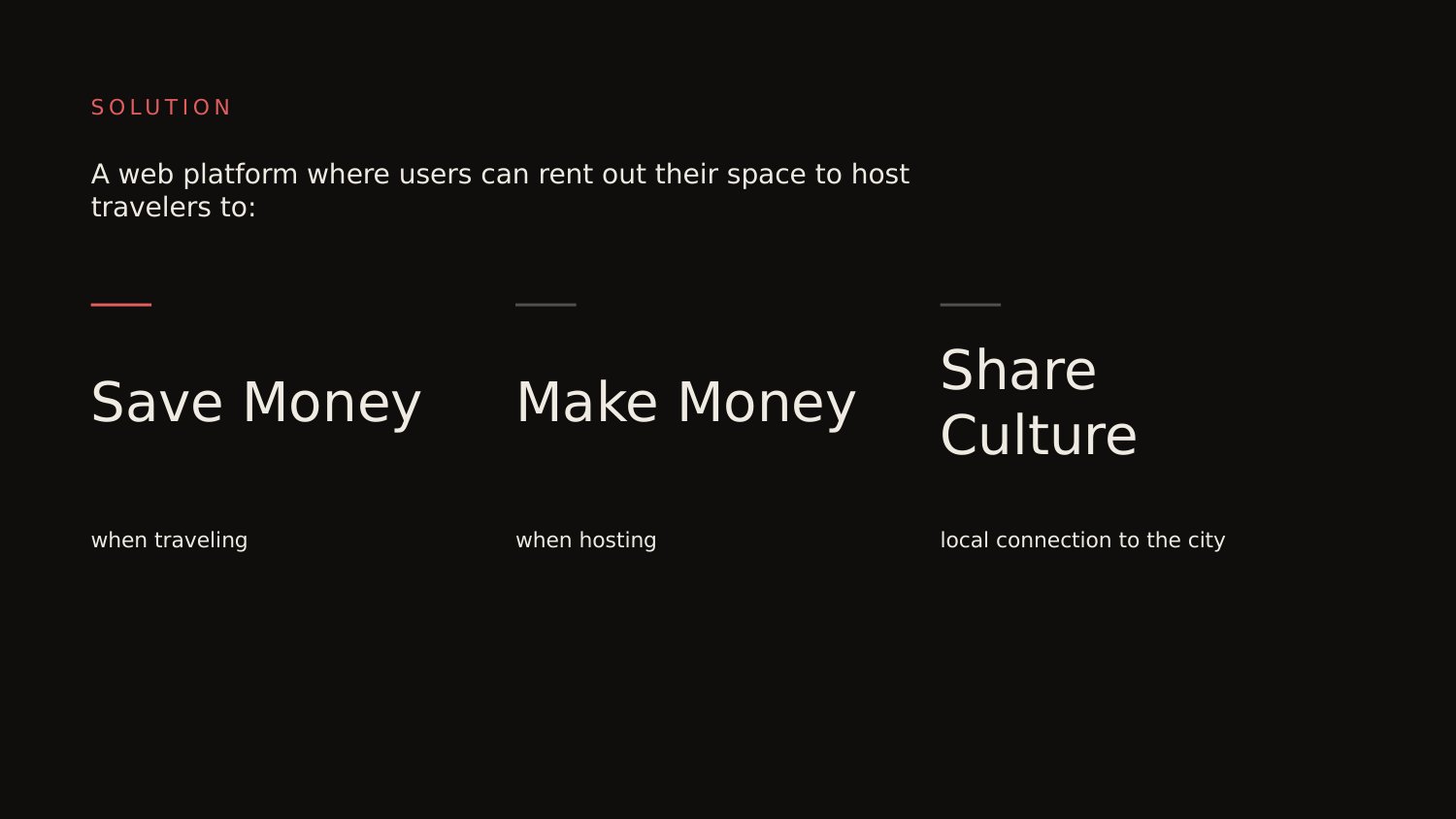
The original is structurally near-perfect for a 2008 seed pitch. Slide one names the product. Slide two states the problem in three sentences. Slide three resolves it in three nouns: Save Money, Make Money, Share Culture. By slide four the audience has the entire thesis and two real comparables to weigh it against. Founders who've spent six months in product debate almost never trust a pitch this short — these three did.
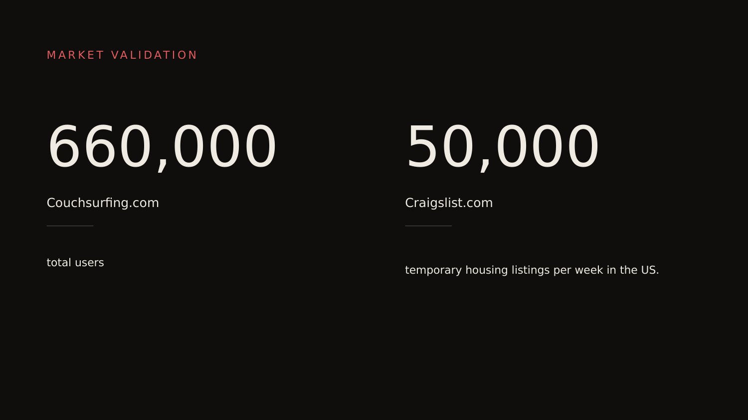
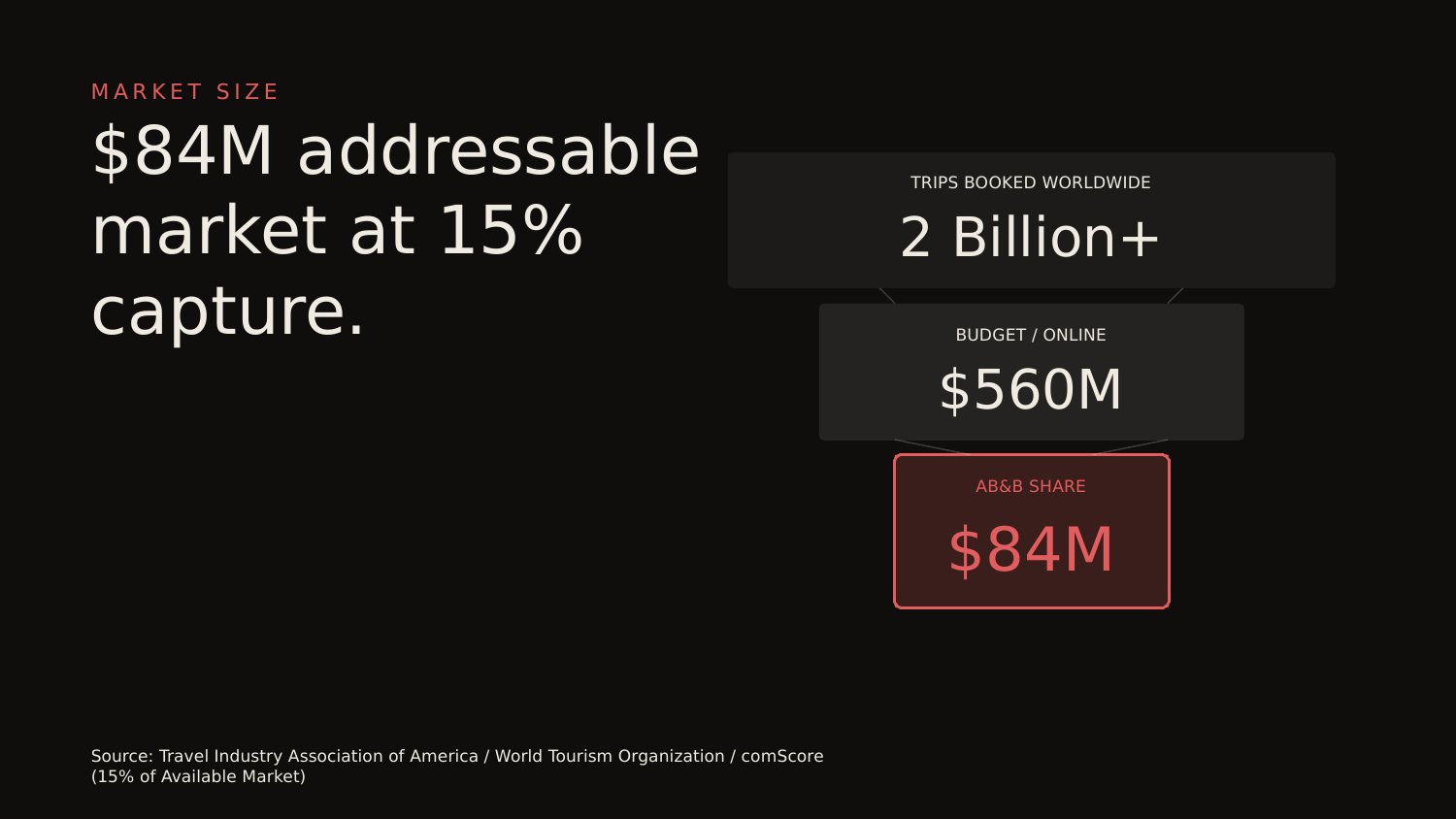
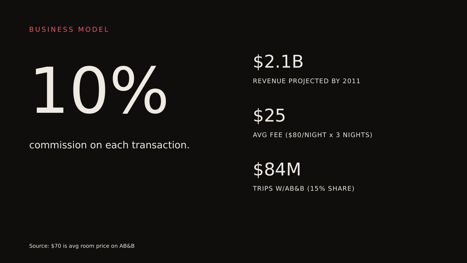
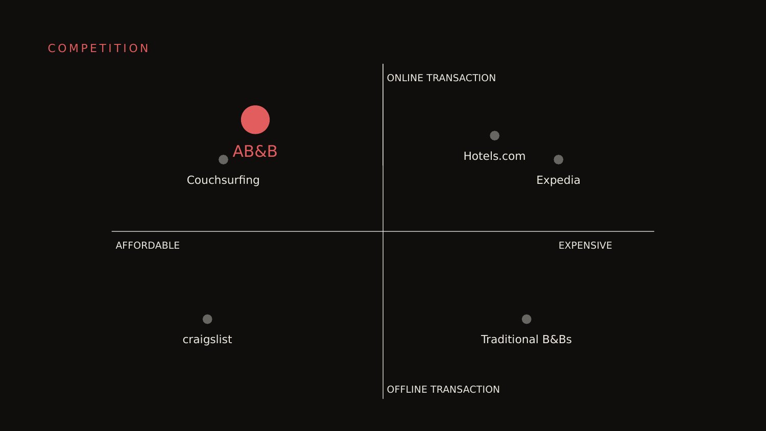
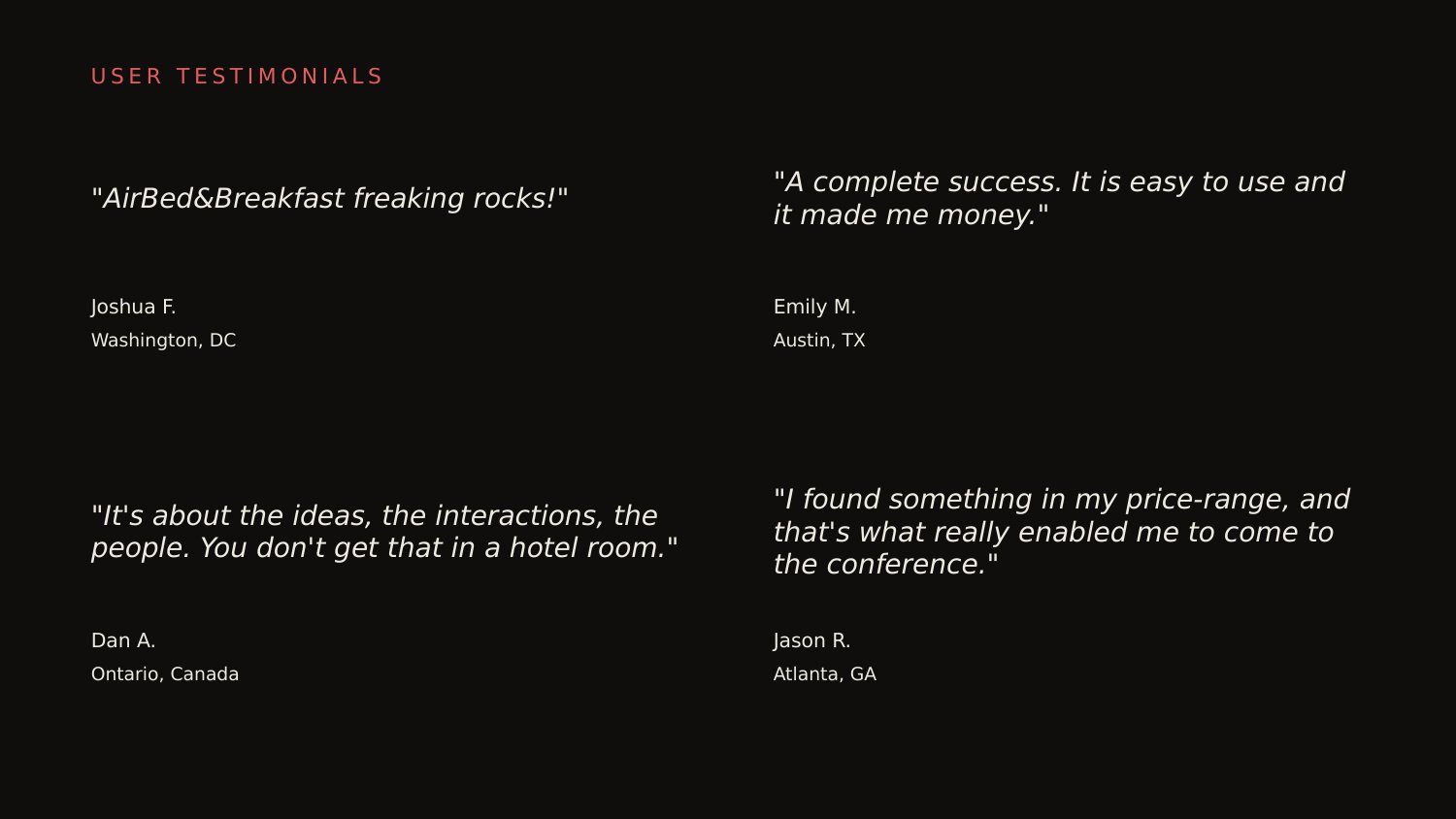
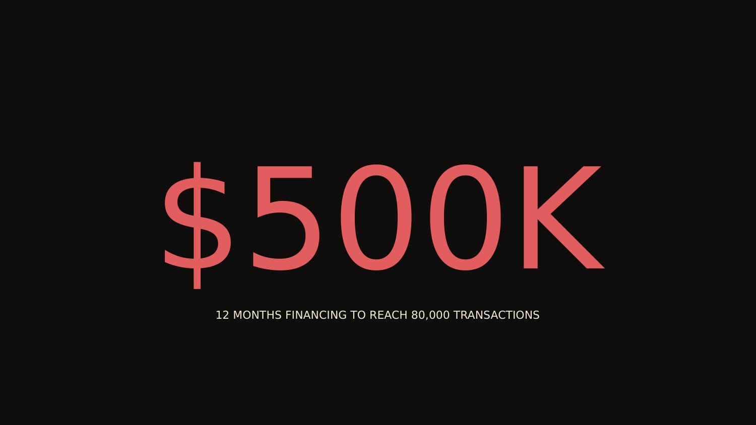
What worked was the discipline. Fourteen slides, one argument each. The market-validation slide cited two real comparables — Couchsurfing's 660,000 users, Craigslist's 50,000 weekly listings — instead of projections. The competition slide was an honest 2×2, plotting the company in the same quadrant as Hostels.com rather than in some imaginary blue ocean. The financial slide was a single number, $500K, tied to a single milestone, 80,000 transactions. None of that is rhetorical sleight-of-hand. It's an argument that wants to be fact-checked.
What didn't work was almost entirely surface. The wordmark on the cover reads like clip art. The product slide stacks three browser screenshots at off-axis angles, asking the audience to do the parsing. The market-size circles on slide five aren't proportional to their numbers — the chart undermines its own headline. Press quotes float in speech bubbles with tails, the kind of UI element you draw when you don't want to commit to a layout. None of this hurt the round. It did, in 2008, mean that anyone reading the deck had to do the founders the favor of looking past it. The redesign is what happens when no one has to do that favor anymore.
The brief pulled in three directions. The redesign had to read as 2026, not as retro-2009 and not as generic startup slick. It had to keep the founder voice — three industrial-design grads with a half-built site and a shoestring — without dressing them up as something they weren't. And it had to anticipate the brand Airbnb actually became without imitating today's logo.
Fraunces solved the first problem. It's a variable serif used in editorial more than in tech; setting the deck in a serif moves the register from software-pitch to magazine-feature, which matches the company Airbnb argued it was going to be — a hospitality brand, not a SaaS product. IBM Plex Sans handles body and labels without competing for attention. The accent is a muted coral, not the hot magenta of the original wordmark — same warmth, dialed down by fifteen years and a brand maturity. The background is a warm near-black, the kind that reads as evening lamplight rather than studio gallery. None of this is neutral. Each choice positions the deck at a specific point on a hospitality-tech spectrum, and that point is closer to a Kinfolk feature than a Y Combinator demo day.
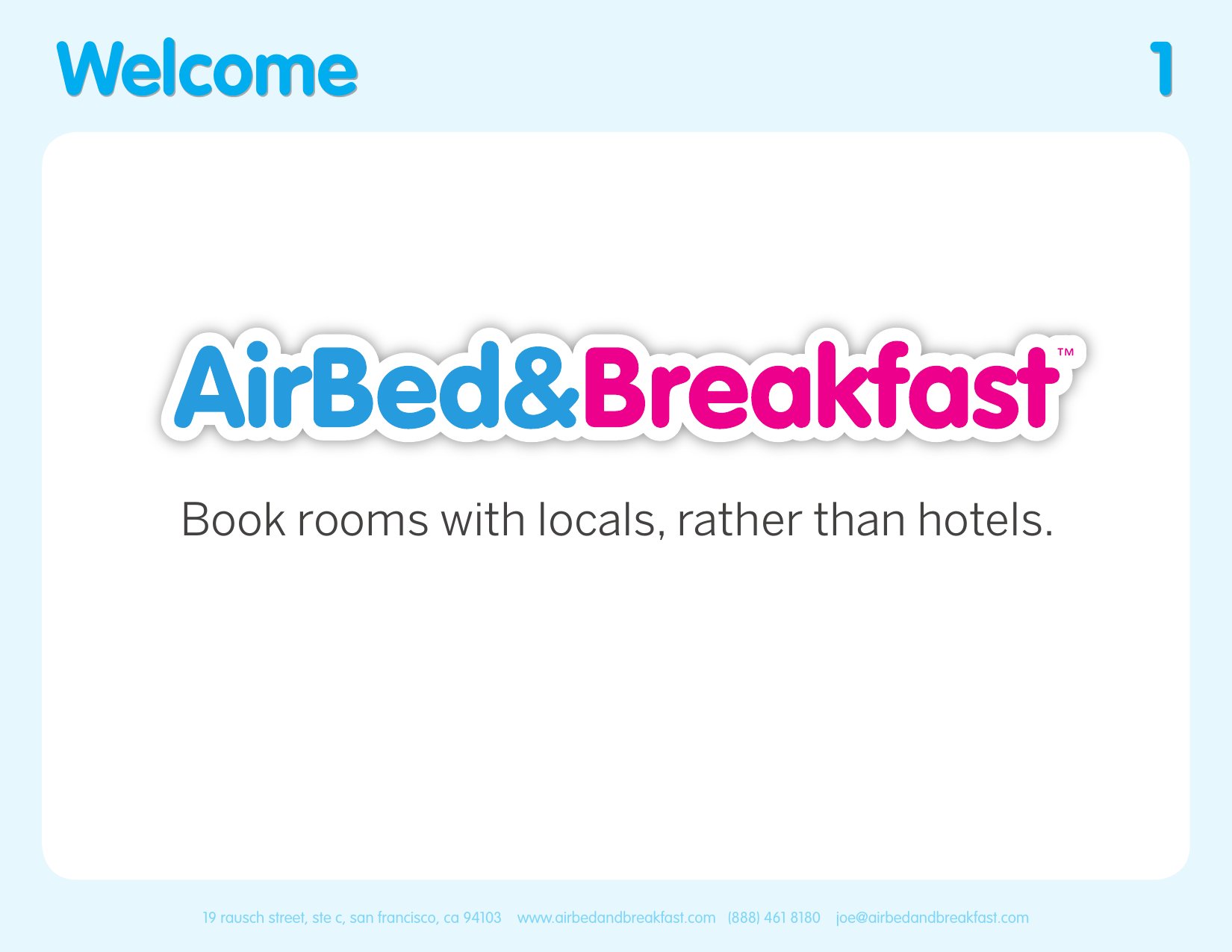
The original cover sells the company with a logotype that looks made on a Saturday night. That was, partly, the founders' point — they were broke, they were quick, they were charming. The redesign loses the charm and gains the conviction. The brand mark breaks across two lines because it's too big to fit on one. The ampersand is coral because the company is a marketplace and the ampersand is what a marketplace is. Three-quarters of the slide is empty because the cover doesn't need to do persuasion — that's what the next thirteen slides are for.
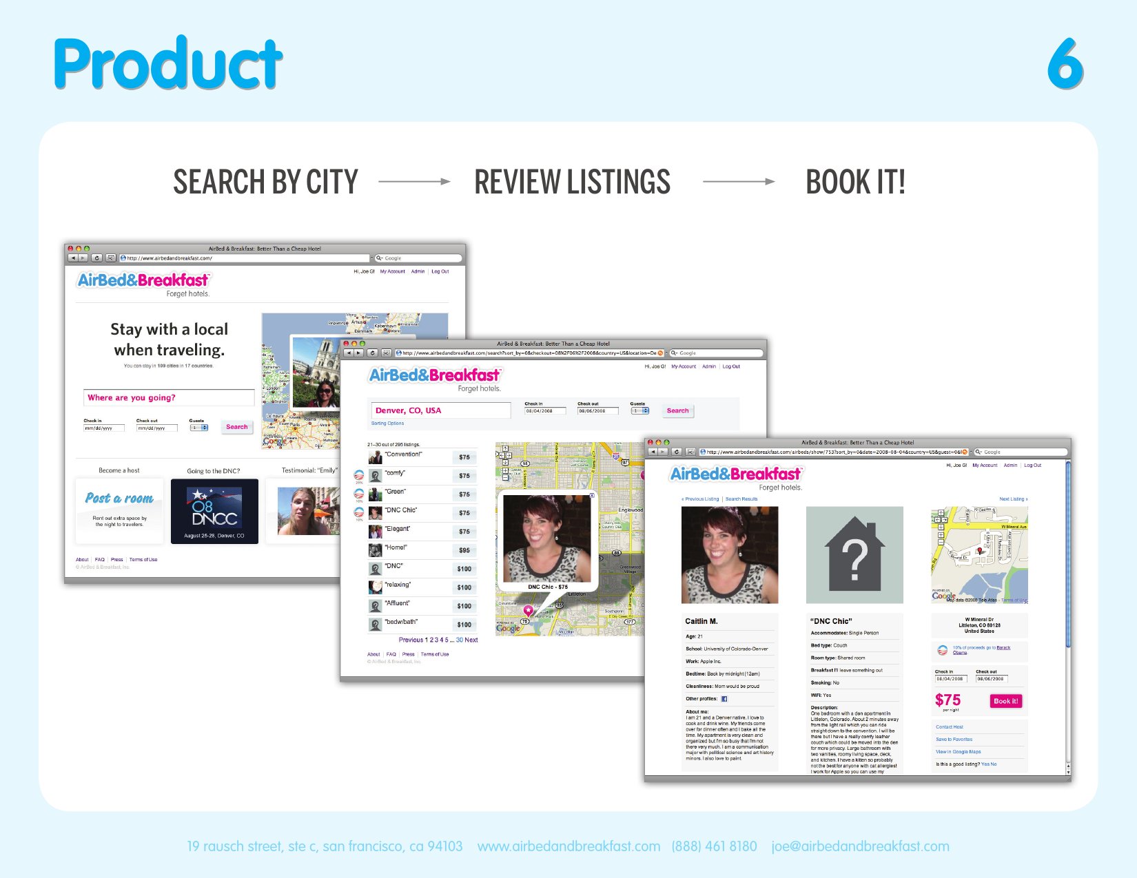
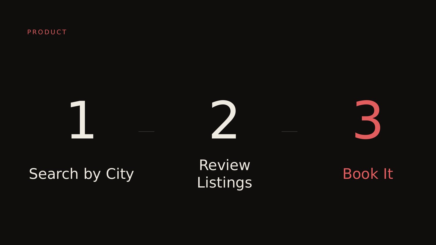
The original product slide is the one most pitch coaches would defend: three browser screenshots, the actual interface, evidence the thing exists. The redesign deletes the screenshots and shows three numbered words. The argument behind the deletion is specific. In 2008 the screenshots were proof-of-build for an audience that didn't trust marketplace startups; in 2026 they read as cluttered and obvious. The audience for any pitch read seventeen years after the round closed already knows what a search-and-book interface looks like. Showing it again competes with the argument the slide is actually making, which is that the flow is three steps and that's the whole product.
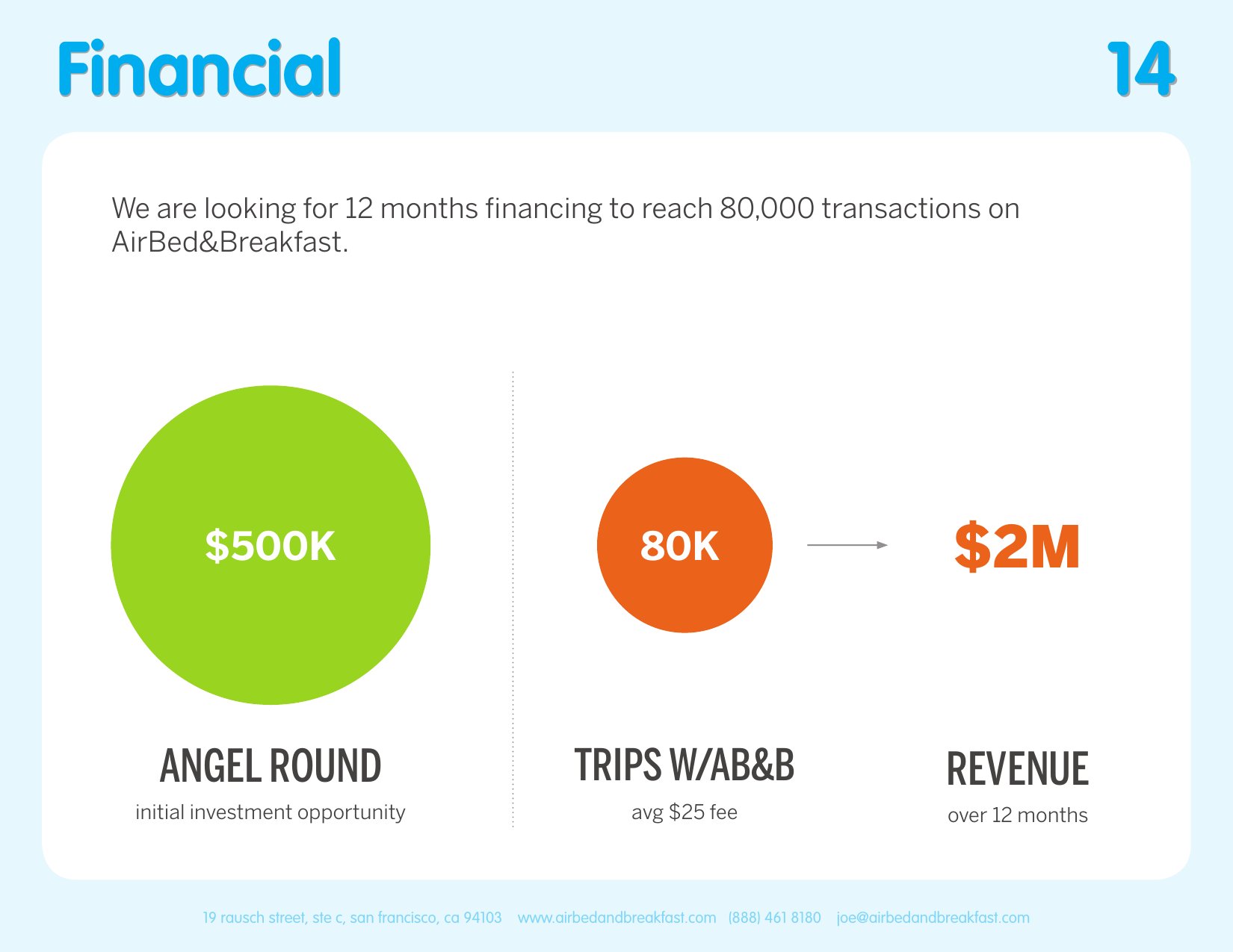
The ask slide is the cleanest test of whether the design system holds. One number. One line. A whole field of warm near-black around it. The original had three orange circles — initial investment, trips, revenue — competing for the same attention; the redesign tells the story in the type sizes themselves. $500K is an order of magnitude larger than the supporting line beneath it because that's what the slide is actually asking for. Every other element that could appear here was deleted on the principle that the ask shouldn't have to share the page.
The original raised the round despite its design. This is what it would have looked like if its design had been part of the argument.
The redesign is a counterfactual, not a verdict. Sequoia funded Airbnb on the founders, the thesis, and a deck that left both of those things to do their own heavy lifting. It worked. The exercise here is to ask the smaller, more selfish question: what would the same fourteen slides look like if the visual work were doing its share?
The answer is the deck above. Quieter. Slower. More confident in less. It's not the deck Airbnb needed in 2008 — Airbnb in 2008 needed exactly the deck it had. It's the deck the seed pitches of 2026 ought to look like, made by founders who don't yet have the luxury of being legendary.