The Redesign
Cover · Front · Series A · Redesigned 2026
Mathilde Collin's 2016 Front deck raised $10M. The deck was published openly with annotations. The original was already designed competently. This is what one level of craft above competent looks like.
Mathilde Collin published her Front Series A deck in 2016 — not after the round closed, not as a retrospective, but openly, on Medium and SlideShare, with annotations walking readers through what each slide was trying to argue and why. The deck raised $10M from Sequoia. The annotated version became one of the most circulated B2B SaaS pitch artifacts of the decade, studied by founders who had never met her and cited in essays about how to structure a Series A narrative.
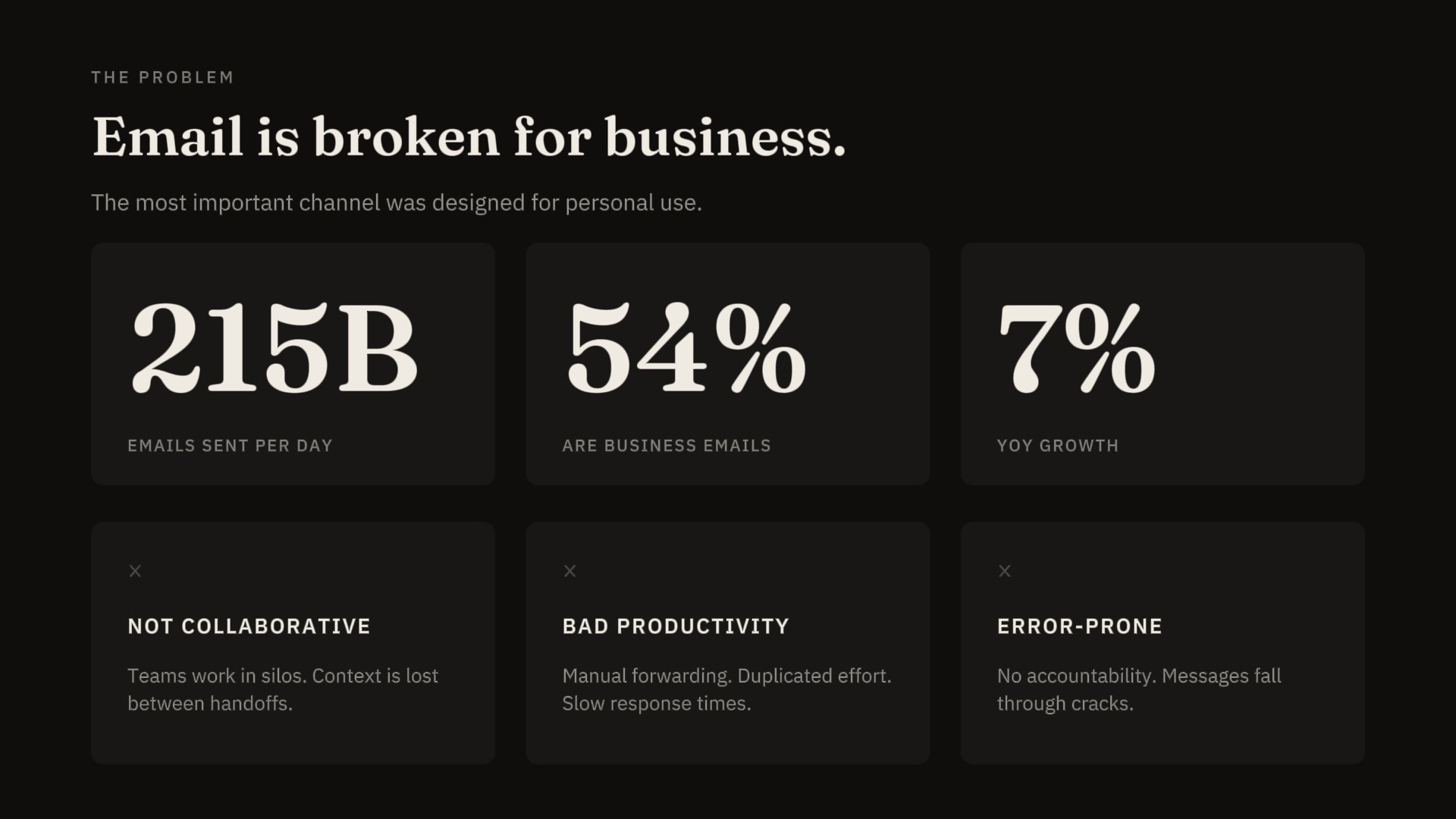
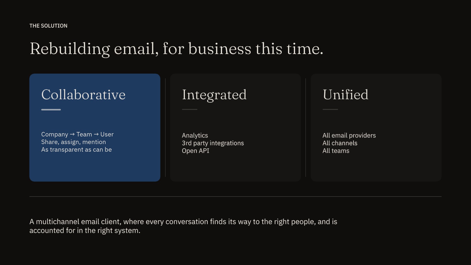
What made the deck worth publishing was that it was already disciplined. Ten arguments, each with a slide. Numbers on every claim — burn rate, MRR multiple, the exact dollar gap between seed and Series A. A competitive matrix that admitted where the incumbents were strong. A capital-efficiency slide that volunteered the burn rate before anyone could ask. The design was competent — pink-coral header bar, clean type, balanced layouts — and the design got out of the way of the arguments, which is most of the job.
Refining a deck that already works is a different exercise than rescuing one that doesn't. The Airbnb 2009 redesign had room to argue with everything: the typography, the hierarchy, the cover. Front's 2016 deck has none of that room. The redesign has to earn its place by making decisions the original didn't quite make — choosing editorial asymmetry over balance, ink-blue over coral, takeaway-headlines over category-headlines. Smaller moves, higher stakes for each one. The discipline here is restraint.
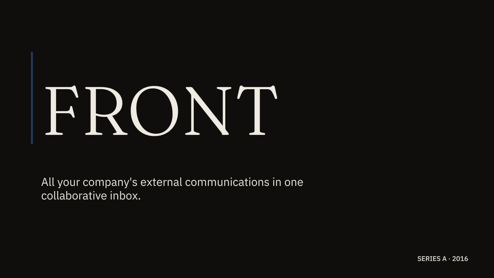
Cover · Front · Series A · Redesigned 2026
The Front 2016 deck got the hardest thing about a Series A pitch right: the narrative discipline. The deck moved through every argument a Series A pitch is expected to make — problem, solution, competitive landscape, traction, customers, satisfaction, growth, churn, focus, acquisition, retention, capital efficiency, ask, team, roadmap, projections, funding history, opportunity. Each argument owned its slide. None of them shared. The deck never asked the audience to follow two threads at once, which is the failure mode of nearly every Series A pitch — the slide that tries to be a problem statement and a market-size argument at the same time, and lands as neither.
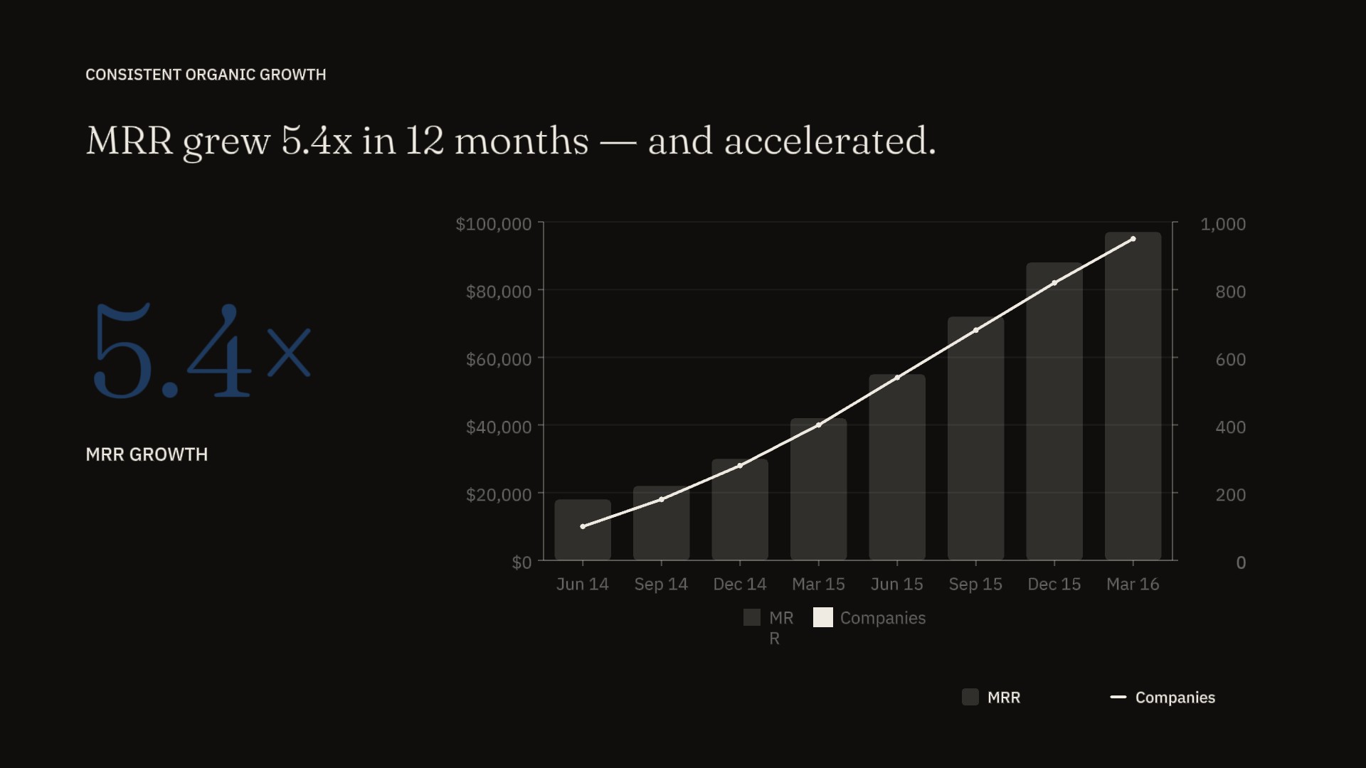
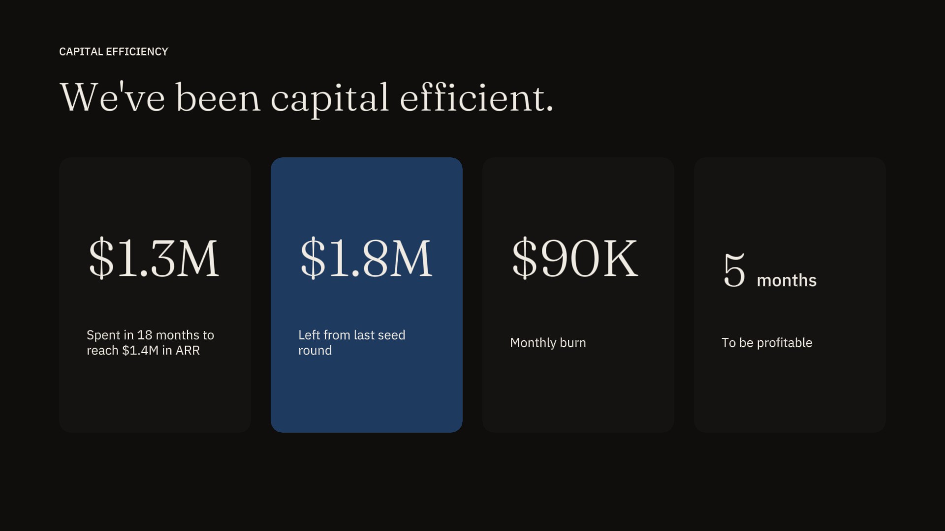
The data discipline matched the narrative discipline. The growth slide showed a real chart with real axes, not a hockey stick redrawn for the deck. The churn slide volunteered the negative net MRR churn number rather than burying it in commentary. The capital-efficiency slide listed four numbers in sequence — $1.3M spent, $1.8M left, $90K monthly burn, 5 months to profitability — and let the reader do the arithmetic.
And then there is the artifact's most unusual quality, which is that it exists at all. Mathilde annotated the deck and put it online. Other founders had shared decks before — Airbnb's seed deck was already circulating by 2016 — but few had narrated their own logic publicly while the company was still mid-flight. The act of publishing it was itself an argument: this deck is good enough that I'm willing to be judged on it. That confidence is part of why the deck worked, and part of why it became canonical.
What didn't quite land was the visual register. The pink-coral header bar runs across every content slide, anchoring the deck visually but reading more consumer than B2B — closer in temperature to a consumer brand than to the enterprise communications tool the deck was actually pitching. The header treatment also flattens the hierarchy: every slide gets the same band, so the cover, the problem, the ask, and the close all wear the same hat. The original gained consistency from this and lost the ability to signal which slides were arguments and which were inflection points.
The layouts inherited the same balance. Most content slides are symmetric — three-column splits, two-column compares, centered single-stat callouts. Symmetry is the safe answer for a deck that's being read as a PDF as often as it's being presented, and it served the original well. But symmetry costs hierarchy. When every slide is balanced, no slide tells you what to look at first. The redesign's most consistent move is replacing balance with editorial asymmetry — letting the most important number on each slide actually be the biggest thing on the slide.
And the headlines were category labels, not takeaways. "Consistent Organic Growth" describes what the slide is about; it doesn't tell you what to conclude from it. The slide already contained the conclusion — MRR grew 5.4 times in 12 months — but it lived in a small caption beneath the chart rather than in the headline that gets read first. Several slides in the deck had this same shape: a takeaway hiding inside a chart, with a category label sitting where the takeaway belonged.
Three constraints shaped this redesign, and all three pulled in the same direction. First, the original was already designed — the system has to argue for its decisions rather than fill a vacuum. Second, the deck is B2B SaaS, which has a different rhetorical job than consumer marketplaces or strategic memos: it needs to read as serious without reading as airless. Third, the personality has to survive. Front's deck had a quiet confidence that came from Mathilde's voice in the annotations, and any redesign that erased that confidence would have replaced one register with another instead of refining the original.
The system landed on three decisions, in order of how much they cost to defend.
The accent color is deep ink-blue. Not the blue of LinkedIn, Salesforce, or any of the enterprise dashboards the original was distancing itself from when it picked coral in the first place — that blue is corporate-default, the visual equivalent of Aptos. Ink-blue is the blue of editorial print, of mid-century financial reporting, of The Economist's spot color before it went red. It signals seriousness without signaling sterility, and it lets the typography carry the warmth that color isn't doing. The original chose coral to escape the corporate-blue trap, which was the right move in 2016. The redesign chooses ink-blue because the trap has moved — the corporate-default color is now a flat, cool blue used at 80% opacity on marketing sites, and the way to escape it is to commit to a blue with depth and history rather than to flee to a warmer hue.
The display face is Fraunces, the body face is IBM Plex Sans, and the labels are IBM Plex Mono. This sounds like a typography choice but it's actually a hierarchy choice. The original used a single weight for headlines, body, and captions, which is why the headlines never quite earned their position — there wasn't enough typographic distance between a slide's title and its supporting text. Fraunces in display sizes carries a hundred years of editorial weight; Plex Sans at 14–16pt holds body copy without competing; Plex Mono at 11pt sets labels and metadata in a register that says this is reference, not argument. Three faces, three jobs, three hierarchies. For B2B SaaS, where the deck is read once in a partner meeting and skimmed afterward in the partner's inbox, hierarchy is the entire game.
The layout principle is editorial asymmetry. The original deck was symmetric almost everywhere — three columns, two columns, centered single-stat callouts. Symmetry is what a deck reaches for when it isn't sure which element matters most, and the original reached for it consistently. The redesign asks the harder question on every slide: which number is the argument, and which numbers are the support? Once that question has an answer, the layout writes itself. Asymmetric layouts do the work of a takeaway-headline before the audience has even read the words.
These three decisions — color, type, layout — are the entire system. There is no fourth move, no illustration style, no custom iconography, no decorative motif. The original deck didn't need one and the redesign doesn't either. The discipline of refinement is the discipline of subtraction; the system earns its place by being smaller than the problem.
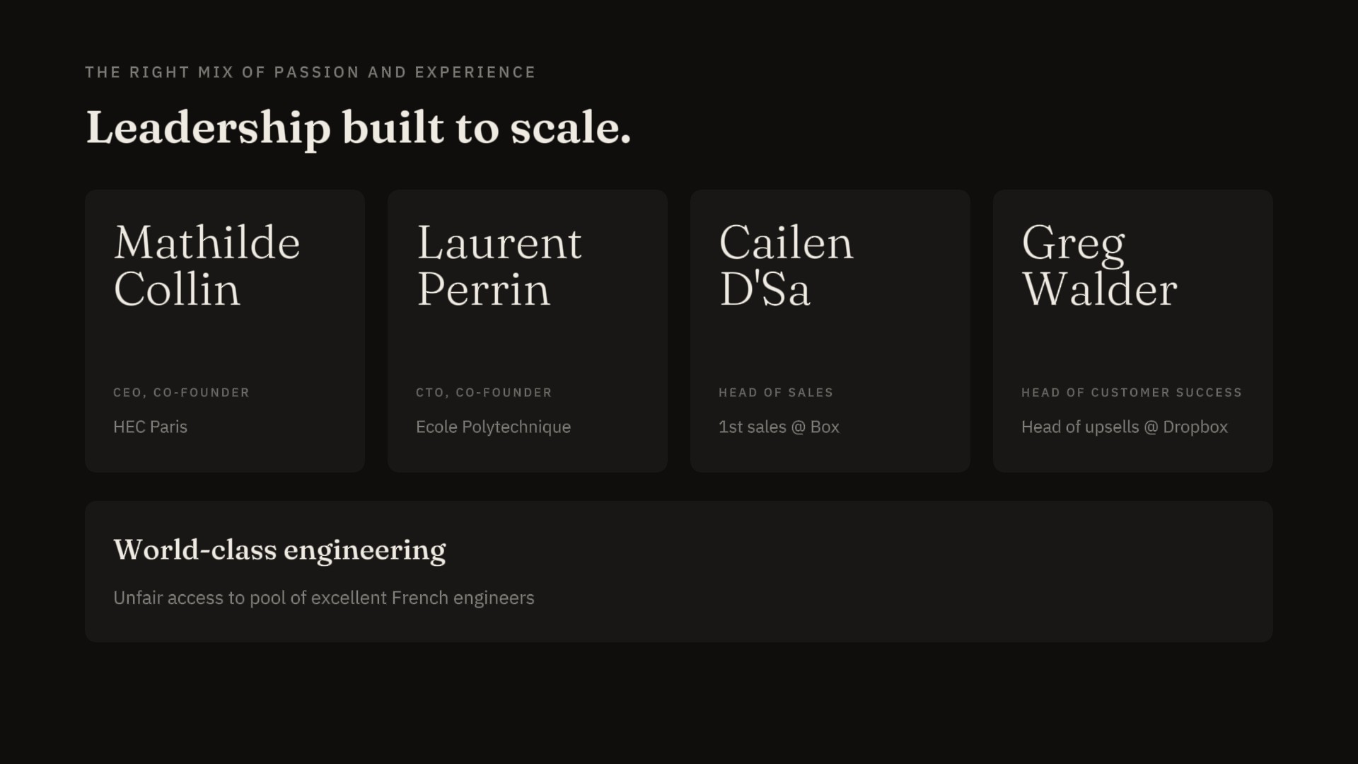
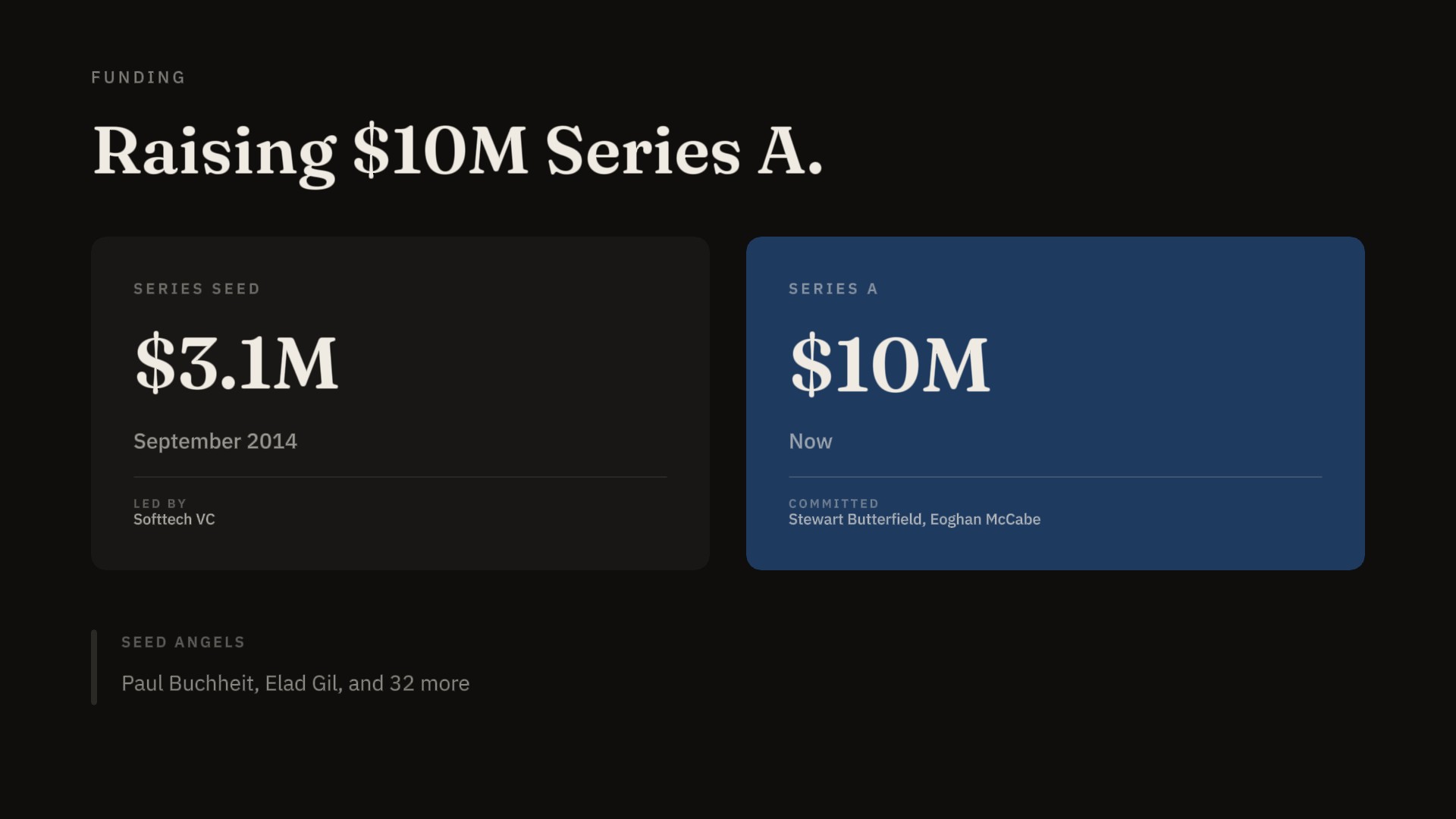
The ten slides shown are a selection across the deck rather than the first ten in sequence — cover, problem, solution, customer evidence, growth, capital efficiency, team, funding, opportunity, close. Each chosen for what it asks the redesign to defend. The cover sets the visual register; problem and solution carry the thesis; customers and growth carry the evidence; capital efficiency carries the argument the original made best; team and funding carry the credibility; opportunity carries the closing argument; close earns the silence at the end. The slides not shown in the showcase aren't slides the redesign skipped — they're slides that would have repeated decisions the showcase already made, or that fold into the slides the showcase does include.
The original cover did three things at once: it set the brand identity, it stated the product positioning, and it greeted the reader. The blue-confetti pattern was warm and consumer-leaning, which was the right counter-move in 2016 against an enterprise-software category that read as airless. Ten years later, the counter-move has been absorbed and reversed — every B2B SaaS landing page in 2020–2023 used a friendly illustrated background, and the field has since cycled back to editorial typography. The redesign goes with the current cycle: ink-blue ground, paper-cream wordmark in Fraunces, single line of italic tagline beneath, no pattern. The cover stops greeting and starts declaring. The decision the original made (warm against airless) and the decision the redesign makes (typographic against decorative) are the same decision answered for two different visual eras. The cover is where the case study's central thesis is most visible: refinement is reading the room a decade later, not reversing the original's choices.
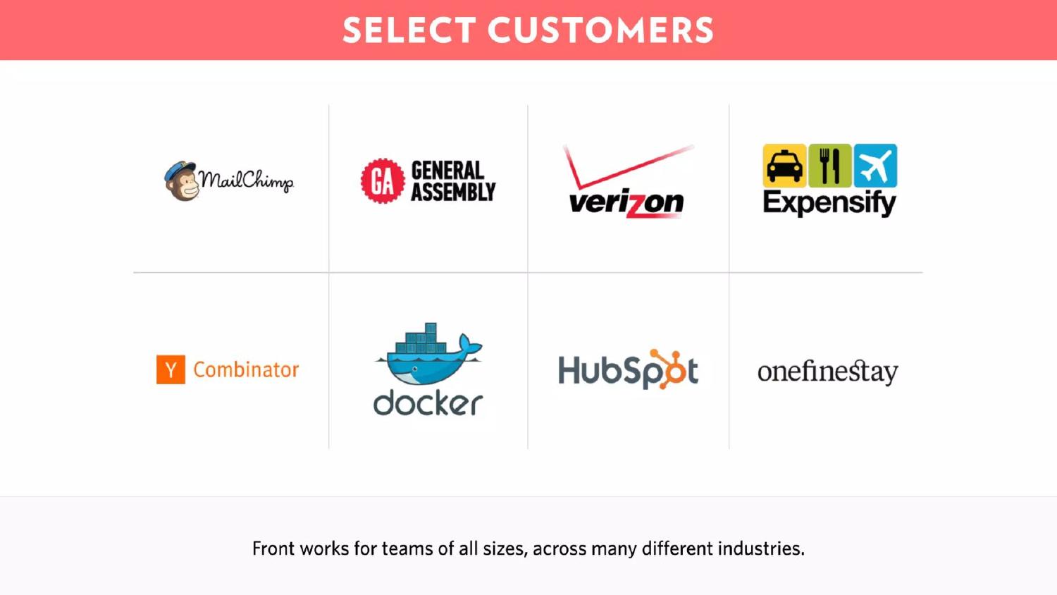
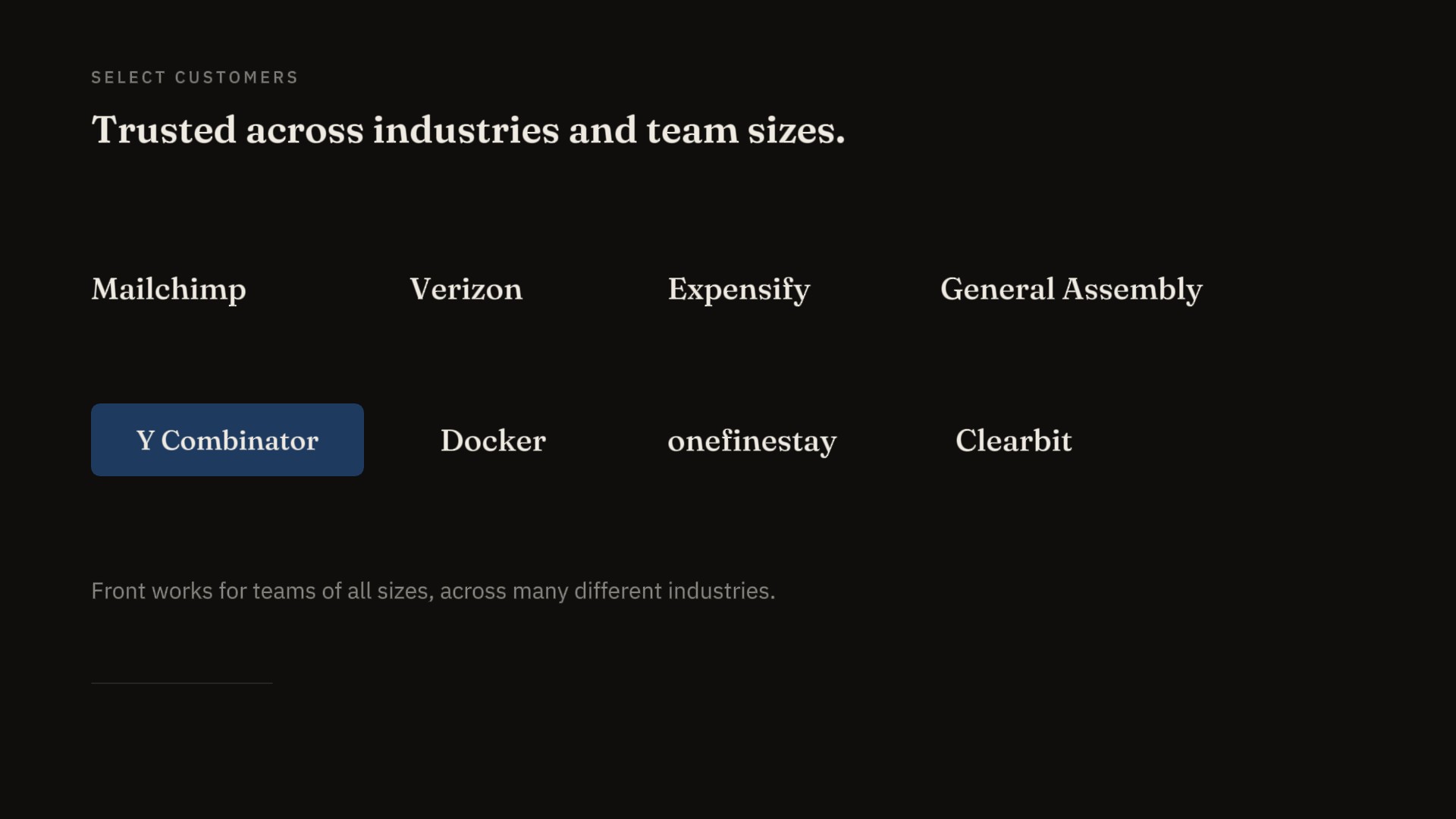
The original showed eight customers — MailChimp, General Assembly, Verizon, Expensify, Y Combinator, Docker, HubSpot, OneFineStay — each in their native brand color. This is the default treatment, the one almost every deck uses, and the reason it's the default is that founders worry the audience won't recognize the names without the visual support of the brand identity. The worry is wrong. By the time a deck reaches a Series A audience, the audience reads the names; the colors are noise. The redesign sets every logo at the same weight, in the same ink tone, on the same paper ground, with the same proportional scale. What's lost is the brand-by-brand vibrancy. What's gained is the reader scanning the names in two seconds rather than flinching at MailChimp's yellow against Verizon's red. A customer slide that reads as a logo wall is a customer slide arguing for itself; a customer slide that reads as a list of names is a customer slide arguing for the company. This is the pair that most clearly separates "consumer-marketing instinct" from "B2B-pitch craft," and it's the pair where most decks of any era still get the call wrong.
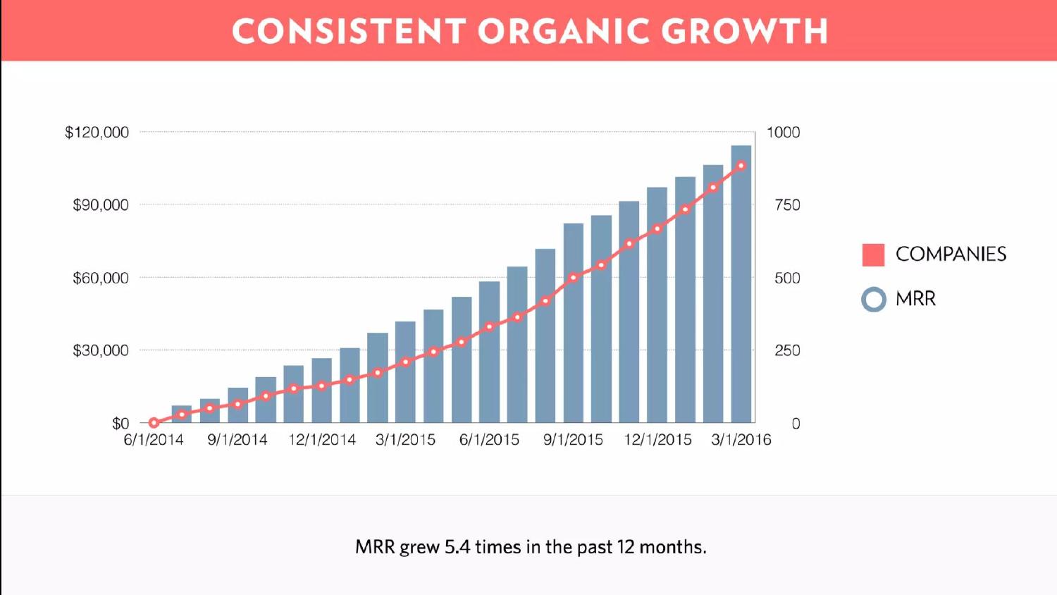
The original headline was "CONSISTENT ORGANIC GROWTH." The redesigned headline is "MRR grew 5.4× in twelve months." Same slide, same chart, same data — the only change is which sentence sits where. The original put a category label at the top and the takeaway in a small caption beneath the chart; the redesign promotes the takeaway to the headline and drops the category label to a small eyebrow. This is the smallest possible change with the largest possible effect, and it's the pair that most clearly demonstrates what the case study means by one level of craft above competent. A category headline tells the audience what the slide is about. A takeaway headline tells the audience what to conclude. The original deck had earned the right to its conclusions — the data was real, the chart was honest — and the conclusions were sitting on the slide in caption-sized type, waiting to be promoted. The redesign promoted them. That is the entire move. Refinement is mostly noticing what the original was about to say and saying it.
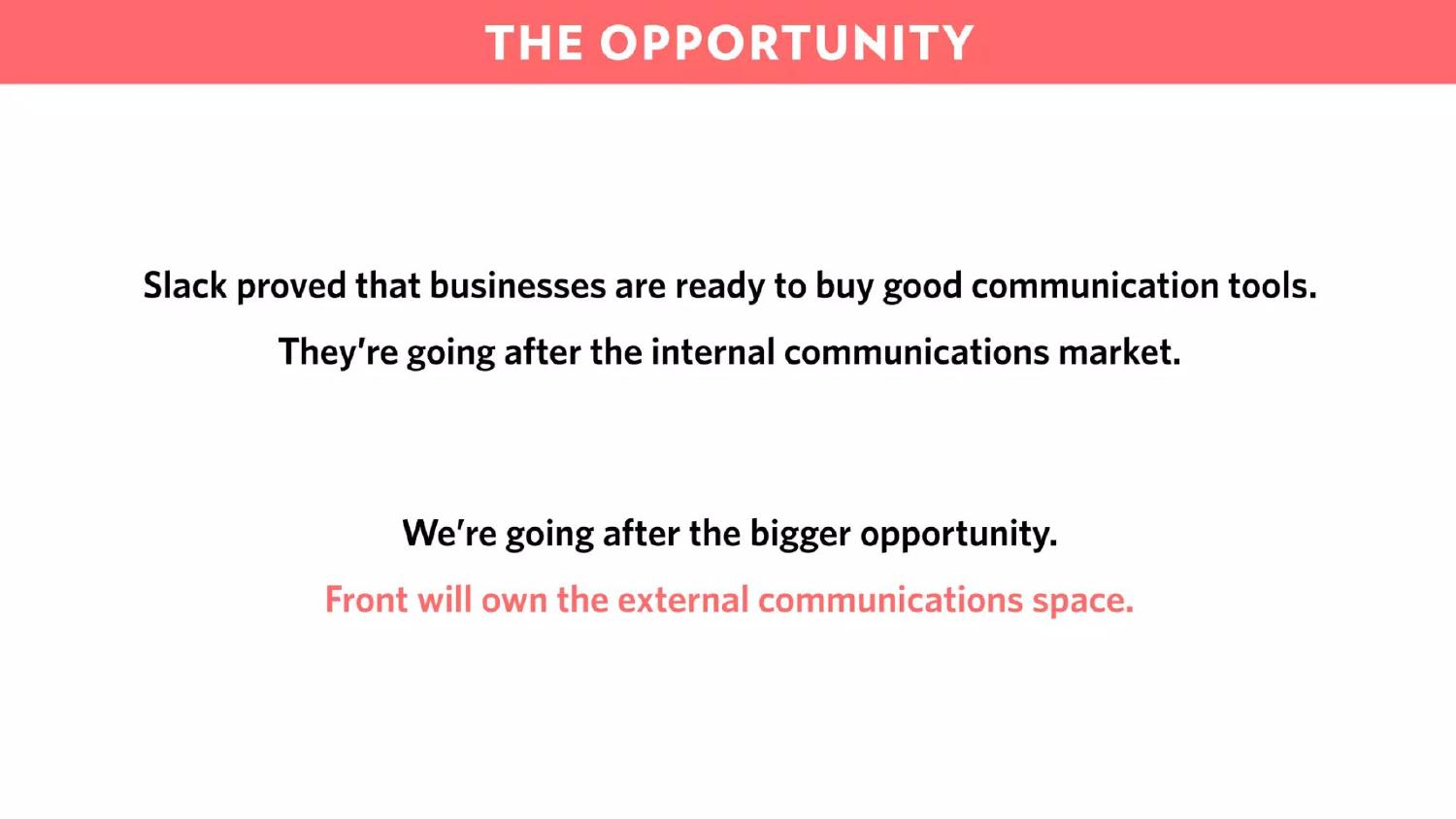
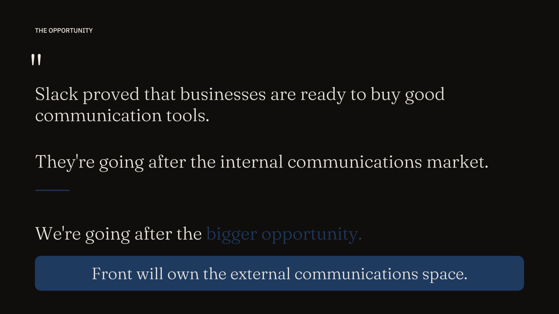
The original stated the slide's argument in four sentences stacked centrally on the page: Slack proved that businesses are ready to buy good communication tools. They're going after the internal communications market. We're going after the bigger opportunity. Front will own the external communications space. The argument is one of the strongest in the deck — it cites a comparable, names the wedge, and claims a larger market — and the original gave all four sentences equal visual weight, set in the same size, the same color, on the same axis. The redesign breaks the argument into its two halves. The Slack premise sits on the left, smaller, in paper-cream Plex Sans, set as the assumption the slide is building from. The Front conclusion sits on the right, larger, in Fraunces display, in ink-blue, set as the thesis the assumption was always pointing toward. The slide stops being a paragraph laid out horizontally and becomes a structured argument: given this, therefore this. Nothing in the words changed. The layout did the rhetorical work the words had been carrying alone, and the result is an argument the reader can see before they read. This is the pair where Chapter 02's editorial-asymmetry claim becomes a single specific decision: when the layout itself names which sentence is the premise and which is the thesis, the audience accepts the conclusion before they've finished reading the page.
Most case studies argue against the original. This one argues with it.
The Front 2016 deck did its job. Mathilde raised $10M, the company became one of the better B2B SaaS outcomes of the decade, and the deck became one of the most studied artifacts of its category. The redesign isn't a proposal that the original should have looked different — it's a study of what the same arguments look like rendered ten years later, by a designer working with a decade more of editorial-software-pitch craft to draw from. The original made the right calls for 2016. The redesign makes the right calls for 2026. The two are answers to the same question asked in different visual eras, and the case study's interest is in the gap between them — not in choosing a winner.
This redesign also completes the studio's three-corner anchor. The Airbnb 2009 redesign was about consumer marketplaces — pitches where the founders are arguing for a behavior change as much as a product, and where the design's job is to give a thesis-driven story the visual confidence the original never claimed. The Sequoia Black Swan memo redesign was about strategic prose — long-form argument where the design's job is to let the reading do the work, and where the typography is the entire interface. This Front redesign is about B2B SaaS — pitches where the founders are arguing for category leadership in front of audiences that have read forty similar decks that quarter, and where the design's job is to make the deck readable at every speed it will be read at. Three corners. Each one a different rhetorical category, each one a different design problem.
The reason the studio's portfolio is built this way is that future clients hire a presentation designer they can argue is right for their specific deck — not a generalist who has done a little of everything. A founder pitching a Series A in B2B SaaS sees the Front case study and knows the studio has thought about their problem specifically. A founder pitching a consumer marketplace sees the Airbnb case study and knows the same. A partner writing a strategic memo sees the Sequoia case study and knows the same. The case studies don't just demonstrate craft. They demonstrate that the craft has been applied to the kind of deck the prospective client is actually trying to make. Rescue, strategic prose, and refinement — three decks, three categories, three arguments for the studio's range.