TypePitch Deck Redesign
Year2008 → 2026
Slides10 of 25 redesigned
IndustryOn-Demand Services · Seed

UberCab 2008,
re-set.

Before on-demand was a category, before Uber was a verb — twenty-five white slides with a cyan SaaS accent and an argument that deserved a better frame.

Prologue

A deck that closed despite its design.

Garrett Camp pitched a $90 billion company on 25 white slides. He did it with bullet points, a clip-art Mercedes, and a cyan accent color that read like a SaaS dashboard — and he closed the round anyway. The deck was published in 2017 with Camp's own annotations, which is how it entered the canon: not as a masterpiece of persuasion but as proof that the thesis mattered more than the execution, that a sufficiently audacious idea could survive its own packaging.

That's the rescue problem in a single sentence. UberCab's original deck wasn't bad in the way Airbnb's 2008 seed deck was bad — rough imagery, undercooked market framing, a valuation ask that required a leap of faith about whether people would sleep in strangers' homes. UberCab's deck was bad in a subtler way: it had a genuinely strong argument and dressed it in enterprise PowerPoint. The two-sided value proposition was already on slide eleven. The demand forecasting logic was already there. The "$4.2 billion annually" market claim was already there, buried in a dense INSEAD academic table where no one would pause to absorb it. The deck's problem wasn't that it lacked substance. It was that the design actively worked against the substance it had.

The redesign asks a single counterfactual: what would have happened if the visual confidence matched the argumentative confidence? Not whether UberCab would have raised more money — it raised what it needed — but whether the deck could have signaled, from its first frame, that a new service category was arriving rather than a feature shipping. The design answer is different from the business answer. The business answer is that it didn't matter. The design answer is that it should have.

The Redesign
UberCab cover, restaged 2026 — Fraunces wordmark at display scale on warm near-black ground, copper rule, SAN FRANCISCO 2008 in tracked mono

The company name in Fraunces at full display scale, copper rule above, "SAN FRANCISCO, 2008" in tracked mono below. The cover claims its register before the first content slide by refusing to inventory its components.

01

What the deck got right. And wrong.

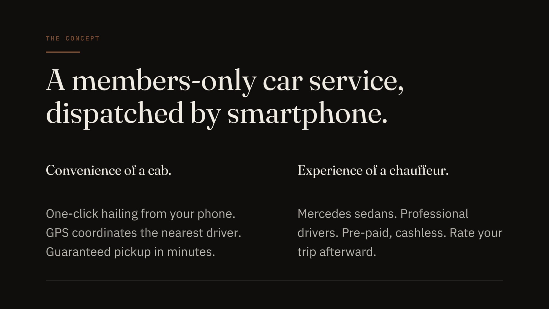
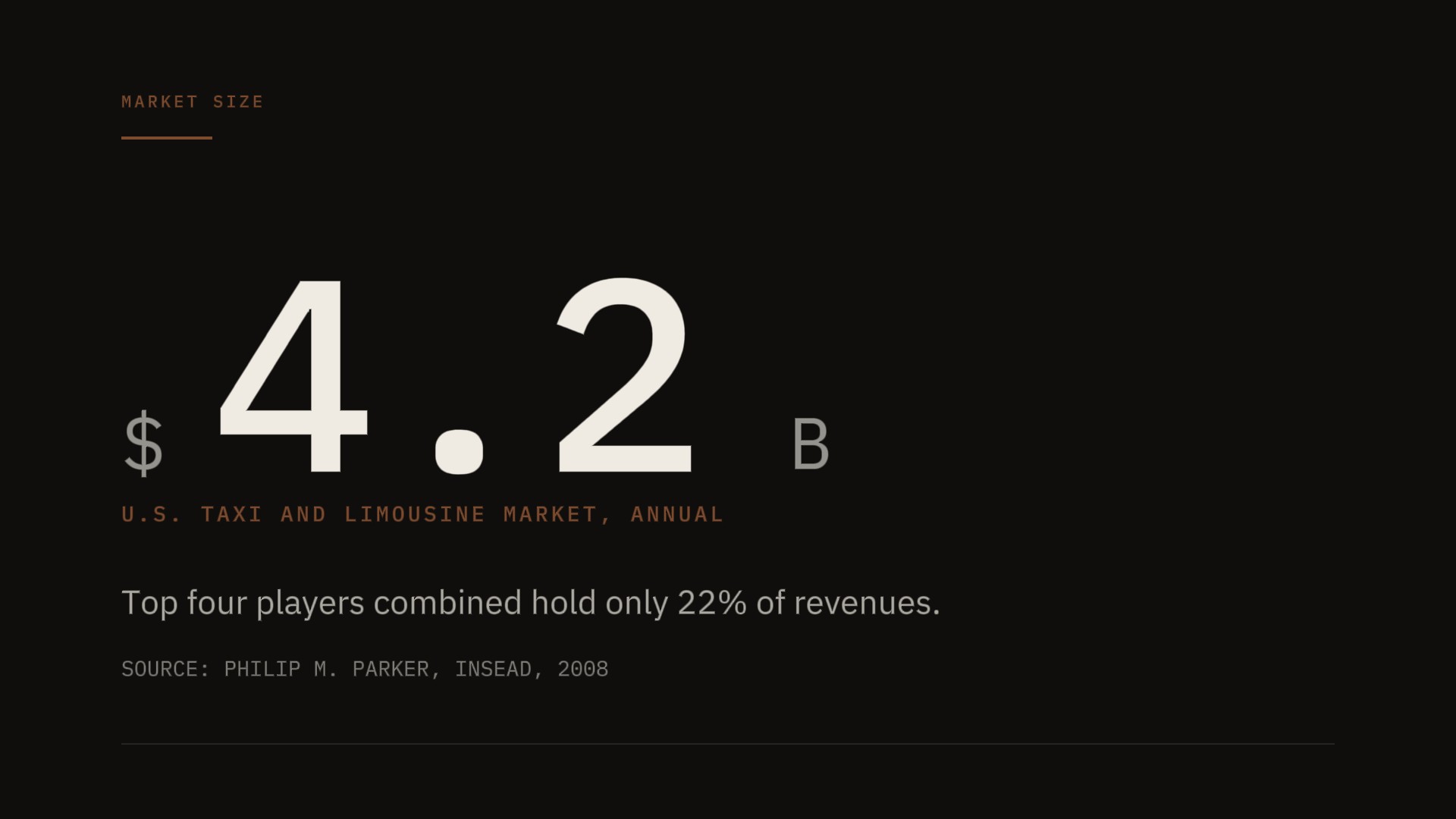
The original UberCab deck got two things right that most seed decks get wrong. First, it trusted its market number. The claim that the U.S. taxi and limousine market was worth $4.2 billion annually appears on slide seventeen with essentially no rhetorical setup — just a sourced INSEAD table and two summary bullets. That's not poor presentation instinct so much as a confidence that the number speaks for itself, which it does, and which most founders don't trust enough to attempt. Second, the concept articulation on slide four — "convenience of a cab in NYC, experience of a professional chauffeur" — is one of the most efficient positioning sentences in early startup history, and Camp wrote it before he had a working product.

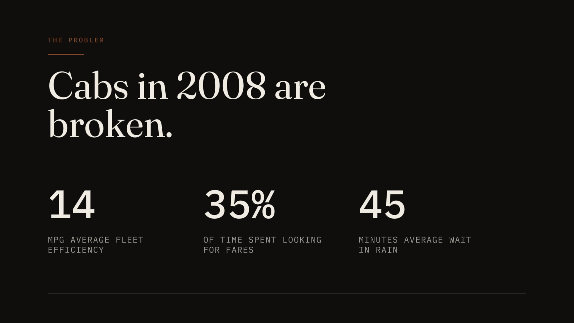
It also got the structural argument right in ways that don't get credit. The problem framing wasn't limited to the rider experience — it attacked the underlying infrastructure. Slide two covered dead time and GPS failure. Slide three went after the medallion system, the structural reason cabs couldn't be good even if drivers wanted them to be. The deck understood, in 2008, that the opportunity wasn't to make taxis better but to make taxis structurally unnecessary. That's a different argument from "our app is faster," and it's the argument that actually funded Uber.

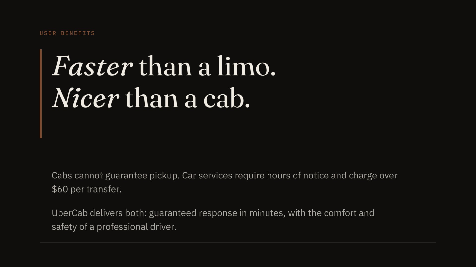
Faster & cheaper than a limo, but nicer & safer than a taxicab. — UberCab pitch deck, slide 11, 2008. The clearest sentence in the deck. Buried in a bullet list.

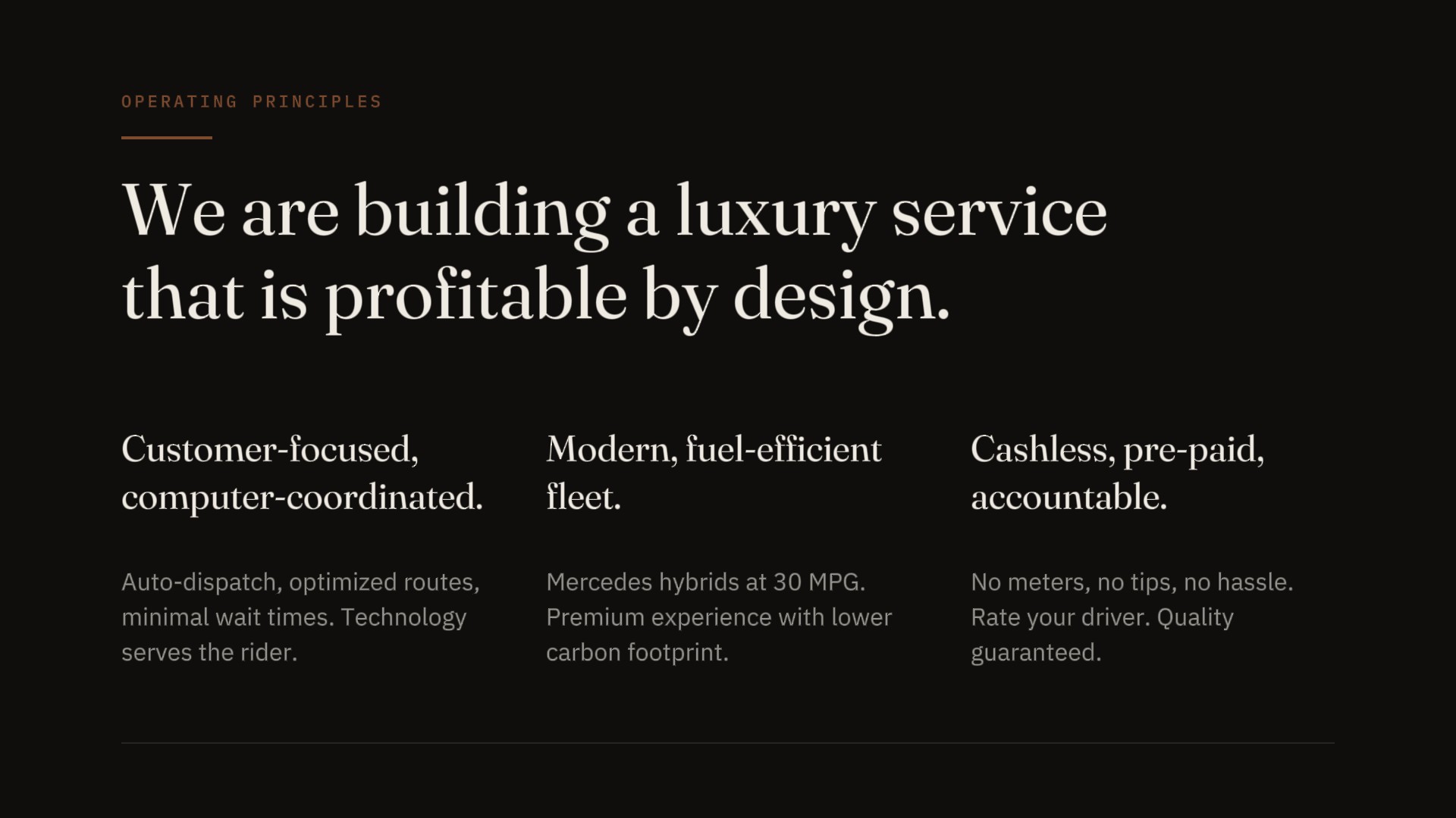
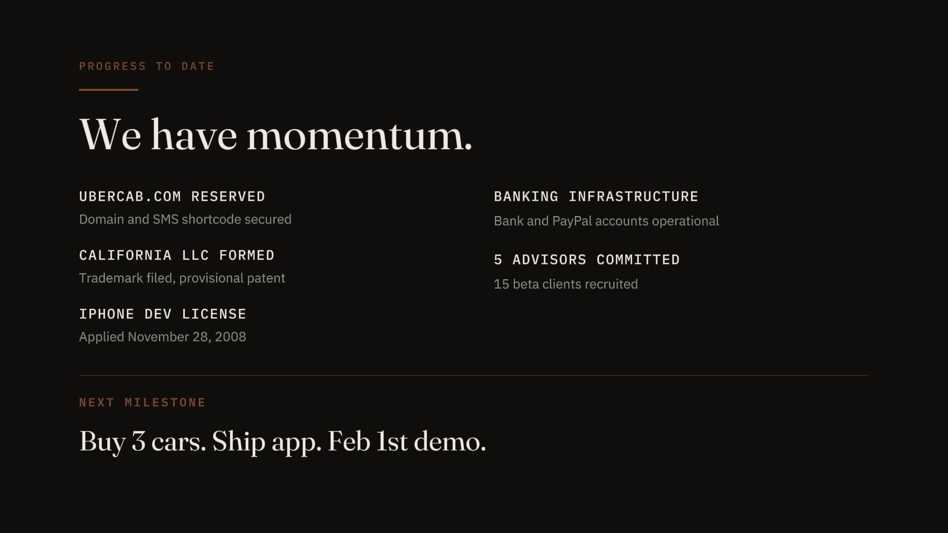
What the original failed was almost entirely visual. The cover presented three clip-art objects — an iPhone, a black Mercedes sedan, a BlackBerry — floating on white with a cyan subhead reading "Next-Generation Car Service." The composition made no argument; it was an inventory. The slides that followed were uniformly white-ground with clean sans-serif body text and cyan accent bullets — the visual language of a software product, not a service category. Operating Principles ran seven bullets. Key Differentiators ran seven bullets. The "$4.2B" number that deserved its own frame was buried in the third row of a table dense enough to read as supporting appendix. There was no team slide anywhere in the 25 slides — the founders were never introduced, which means the deck was asking for conviction without supplying the people who would have to earn it. And the ask itself was embedded in the final slide alongside domain registration and a PayPal account, as if capital were an afterthought to the administrative setup.

02

From SaaS signal to service category.

The original deck used cyan as its accent — a thin, bright highlight applied to selective bullets, the color that said "technology" in 2008 the same way rounded corners and gradients said "software." It was the right color for a SaaS dashboard. It was the wrong color for a service category arguing it already existed. The redesign replaces it with oxidized copper (#7C4A2E) — a warm, patinated hue that sits in the same temperature range as urban infrastructure rather than consumer software. Copper reads as something that has been through use, that has already earned its authority. It distances from the original's cool-tech register without abandoning warmth entirely — the same parallel move that put ink-blue in the Front Series A redesign, where the original's color was doing the wrong work for the wrong category.

Fraunces at display scale does something a sans-serif can't do for this deck: it claims institutional authority before the company has earned the right to claim it. The original's headlines read as presentation software doing its job. Fraunces at full-frame scale reads as a magazine commissioning a verdict. For a deck whose central argument is that a new service category should exist — not that a feature works, not that an app is fast, but that an entirely new way to move through cities is now possible — the typography has to signal arrival rather than pitch. The Airbnb redesign needed Fraunces to communicate domesticity at scale; the UberCab redesign needs it to communicate that on-demand transport is already a real thing, not an idea looking for funding.

The decision to strip nearly every slide to a single governing statement plus supporting evidence is not a minimalism preference — it is a rhetorical argument. The original deck used dense bullet lists as a hedge: seven principles, seven differentiators, six use cases, because the founders were anticipating every possible objection and preemptively answering it in the same frame. The visual result was anxiety made legible. The redesign takes the opposite position: when your thesis is audacious, restraint signals conviction. A slide that says "Cabs in 2008 are broken." and then shows three numbers doesn't need six bullets because it has already made its claim. The investor either agrees or they don't, and no fourth bullet will change that.

Display Type
Fraunces.
Variable serif · 144pt opsz · Soft 30 · Weight 350
Body & Labels
Plex Sans
IBM Plex Sans · body / IBM Plex Mono · labels & data
Palette
Warm ink ground, paper cream, a single oxidized copper. The accent is rationed — used only when something on the slide is being claimed, not described. Distancing from the original's cyan without abandoning warmth.
The Deck

Ten slides. In sequence.

Slide 01 — Cover, UberCab restaged 2026
01 Cover.

Fraunces at full display scale turns the company name from a label into a claim — the wordmark fills the frame rather than crowning it. The copper rule and the mono-spaced "SAN FRANCISCO, 2008" establish the editorial register before the first content slide; the tagline is subordinated to the wordmark, not co-equal with it.

Slide 02 — The Problem, UberCab restaged 2026
02 The Problem.

The original placed a clip-art Crown Victoria beneath six sub-bullets about GPS failure and radio dispatch; the redesign extracts three numbers — 14, 35%, 45 — sets them large in IBM Plex Mono, and lets "Cabs in 2008 are broken." do the argumentative work the original distributed across bullet points. The shift from description to indictment happens entirely at the headline level.

Slide 03 — The Concept, UberCab restaged 2026
03 The Concept.

The original's six bullets are reorganized into a two-sided editorial split — "Convenience of a cab" on the left, "Experience of a chauffeur" on the right — making the two-sided value proposition structurally visible in a way the bullet list never achieved. The reader sees the tension before they read the explanation.

Slide 04 — User Benefits, UberCab restaged 2026
04 User Benefits.

The copper vertical rule is the single strongest design decision in this slide: it left-justifies the headline and signals that what follows is a verdict, not a feature list. Fraunces italic on "Faster" and "Nicer" gives the two comparative claims tonal weight the original's body text never achieved — the italics read as emphasis that's been earned.

Slide 05 — Operating Principles, UberCab restaged 2026
05 Operating Principles.

Seven bullets become one governing statement plus three principle columns. The architectural grid does the organizational work without the visual anxiety of a seven-point list, and "profitable by design" lands as a closer rather than one item among seven.

Slide 06 — Demand Forecasting, UberCab restaged 2026
06 Demand Forecasting.

The original's city routing heatmap was the best visual in the 25-slide deck; the redesign keeps its visual intelligence and removes the PowerPoint container that made it look like an academic export. The abstracted node diagram in cream and copper on dark reads as designed rather than exported, and the caption "SF ROUTING NETWORK, SIMULATED" in tracked mono is the only label it needs.

Slide 07 — Market Size, UberCab restaged 2026
07 Market Size.

$4.2 in IBM Plex Mono at near-full-frame scale, with "$" and "B" as subordinate dimensional labels, copper category label below. The original buried this number in the third row of a 10-year projection table; the redesign's argument is that this number deserved its own frame from the beginning.

Slide 08 — Technology, UberCab restaged 2026
08 Technology.

Three copper-accented column headers — GEO-AWARE DISPATCH / ROUTE OPTIMIZATION / REPUTATION SYSTEM — replace a five-bullet list. The column architecture implies a system rather than a feature set, which is the claim the original was trying to make and never quite landed.

Slide 09 — Progress to Date, UberCab restaged 2026
09 Progress to Date.

The original mixed traction milestones and the ask in a single list, with "NEXT:" highlighted in green. The redesign separates evidence from imperative: a two-column milestone grid above a copper-ruled divider, closing with "Buy 3 cars. Ship app. Feb 1st demo." in Fraunces as a three-beat statement. It is the best writing in the redesigned deck.

Slide 10 — The Ask, UberCab restaged 2026
10 The Ask.

The original buried the ask in the last bullet of the Progress slide; the redesign gives it its own frame with the three-part imperative filling the frame at display scale. "LET'S BUILD THIS." in copper mono is the deck's only moment of direct address — it earns the register because it arrives exactly once.

Before / After

The decisions that mattered.

Original · 2008
Original UberCab cover, 2008 — three clip-art objects on white ground, cyan subhead
Restaged · 2026
Restaged UberCab cover, 2026 — Fraunces wordmark at display scale, copper rule, dark ground

Cover

The original cover presents three clip-art objects on white — iPhone at left, black Mercedes at center, BlackBerry at right — with the logo above in bold sans-serif and "Next-Generation Car Service" below in cyan. The composition is a diagram of the product's components, not a claim about what the product means. It asks the investor to assemble the argument from parts. The redesign understands that a cover's job is to signal what kind of document you're about to read — and that "established, confident, already here" is a more effective opening argument than "look at our three components." "UberCab" in Fraunces at display scale on a dark ground with a copper rule doesn't explain the business; it announces the category.

Original · Slide 02
Original problem slide — nested bullet list with clip-art NYC taxi below
Restaged · Slide 02
Restaged problem slide — Cabs in 2008 are broken. with three stat numbers large

The Problem

The original "Cabs in 2008" slide is a nested bullet list — aging technology, radio dispatch, 14 MPG, hand hailing, no GPS, dead time — with a clip-art NYC taxi at the bottom. The information is correct. The slide makes no claim; it presents a situation and waits. The redesign's argument is a statement: "Cabs in 2008 are broken." Full stop. Then three numbers — 14, 35%, 45 — in IBM Plex Mono at large scale with subordinate labels. The shift from Topic to Statement headline changes the slide from evidence to argument. The original was describing a problem; the redesign is indicting one. The investor doesn't need to connect the dots because the claim has already been made before the numbers appear.

Original · Slide 17
Original market slide — $4.2B buried in a 10-row INSEAD academic projection table
Restaged · Slide 07
Restaged market slide — 4.2 in IBM Plex Mono at near-full-frame scale with $ and B as subordinate labels

Market Size

The original "Overall Market" slide has two summary bullets above a full-width INSEAD academic table showing U.S. Taxi and Limousine Service revenue projections from 2004 to 2014. The $4.2B figure is the 2008 row's first column. It is not large. It is not isolated. It is one data point among eighty. The redesign's single decision: "4.2" in IBM Plex Mono at near-full-frame scale, "$" and "B" as subordinate dimensional labels, copper category label below. A $4.2 billion market number, isolated and set large, is a visual argument for why the opportunity exists. Any investor squinting at a ten-row academic table is already mentally somewhere else. The original trusted the table to make the argument. The redesign understands that the number is the argument.

Epilogue

The original closed the round on twenty-five white slides. This is what it would have looked like if the design had believed in the thesis as much as the founders did.

This is the studio's fourth case study and its second rescue study, and the two rescue studies belong to different problems. The Airbnb redesign asked how you convince someone that a marketplace can exist before the marketplace has proven itself — how you make the case for an emergent category from the demand side. The UberCab redesign asks a harder question: how do you make a service category feel inevitable before a single car has moved? The arguments are structurally different. Airbnb needed to prove that people would trust strangers. UberCab needed to prove that a dispatcher and a driver and a smartphone could constitute a new kind of institution. The design problems that follow from those arguments are different too, and a portfolio that claimed to solve one by solving the other would be lying about its range.

What UberCab adds to the rescue category is the two-sided dynamic — the thing that makes on-demand service harder to argue for than a marketplace. The demand forecasting slide is the clearest expression of that problem, and it's the slide the redesign worked hardest to honor, because the original's visual was genuinely good and genuinely buried. Getting that slide right was the rescue work specific to this deck, not transferable from Airbnb or from any of the other studies in the portfolio. The studio now has rescue work across two verticals — consumer marketplace and on-demand services — with a strategic prose study and a B2B SaaS refinement sitting between them. UberCab raised its round on 25 white slides with cyan bullets and clip-art devices. The redesign asks whether the category itself might have arrived faster — in the public imagination, in the regulatory conversation, in the investor memory — if the deck had looked like it already knew what it was.

Next Case Back to the beginning
Airbnb Seed Deck. All work